Just copy the text?
A ton of brand strategy, design, and research go into choosing a brand’s typography. Your typography is part of your brand identity. Every little curve and flourish counts. We know how important it is to guard your brand’s look and feel, from A to Z. But when it comes time for transcreation, typography can get complicated. Symbols get mixed up. Accents and diacritical marks disappear, and sometimes paragraphs “just don’t look right.”

Before your brand travels, here are 5 key questions to ask about language and typography:
1. What alphabet are you using?
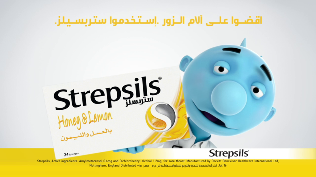
If your copy is in a Latin alphabet then you’re in luck. You can likely choose from 150,000 font families. But what if you’re adapting to Arabic? You may find yourself with only a handful of fonts to choose from. You may need to adjust the fonts manually in order to stylize the characters to match the mood of the original font. You may even need to create symbols from scratch to accommodate for different dialects.
2. How will changing the language affect the visuals and layout?
The language you are adapting to effects not only the look of the copy. It can impact the entire layout. Translation can vastly impact word length, in which case the entire layout needs readjusting. Transcreation is often a hybrid of new content, translated content and adapted images. Whatever the new combination might be, the chosen typography has to support all elements and deliver brand consistency.
3. Will you need to create advanced original characters?
If creating original characters is essential to clear communication, you need a typographer with a firm grasp of each letter’s geometry, and an understanding of the unbreakable rules of each specific symbol. Not knowing these rules can lead to substituting characters with similar-looking symbols from a different alphabet, which will always |ooк sиspicioиs to a native. (See it?)
4. What are the typesetting, punctuation, and transliteration rules of the language?
Dealing with characters is only part of the story. How do you wrap text properly in the chosen language? Are there unique punctuation rules? Do you adjust the spacing between words or characters (as in Latin-based alphabets) or stretch whole words (as in Arabic)? Which numeric system should you use (and yes, there can be several in circulation)? What is the correct way to transliterate foreign words in the local language? This last question is crucial to industries like pharmaceuticals, where some scientific terms may not be fully assimilated in the local language.
5. How is the language oriented?
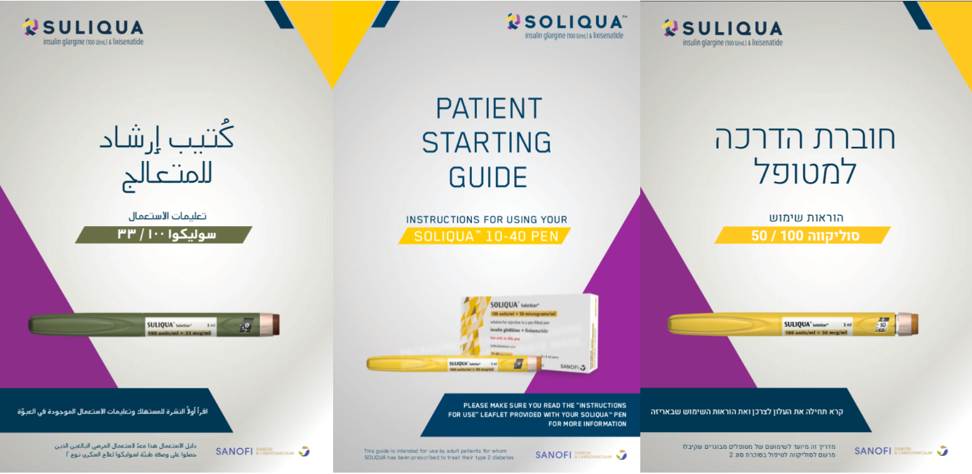
Brand guidelines are usually created for “left to right” languages. When adapting to languages that use right to left script you may need to reorient your visuals to a mirror image of the original. For example, visual guidelines for an Israeli campaign need to be applied “in reverse.” The image may then need additional adjustments to look natural in this flipped state.
At Hercules, our typography experts play an essential role in delivering your brand message across borders. From Amsterdam to Zhengzhou, we can ensure your materials are spot on and your message does not get lost in transcreation.


